
Work
Helping early career teachers to receive retention payments
We designed an online eligibility checker and application for funding in collaboration with the Department for Education

The Claim team at the Department for Education are responsible for giving incentive payments to teachers in their first five years to support retention and improve recruitment. Their mission is to keep teachers teaching subjects where there is a shortage of teachers, particularly in disadvantaged areas.
They were tasked with introducing a new type of incentive payment alongside an existing scheme. With two incentive payments being available at once there is a significant increase in eligible teachers. Up to 7,000 extra teachers across 2,500 schools benefit from the new incentive.
The aim of the project was to ensure teachers can easily move through the service without any problems and that the Claims team has the information needed to efficiently process applications. We used a prototyping method, rapid iteration and user testing to ensure the user experience of the service would work for the teachers who need to use it.
Making the service as simple to use as possible
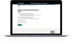
There are 8 to 12 steps to check eligibility depending on the teachers’ situation and up to 19 questions to collect personal details for the application. For the service to be efficient, teachers needed to get through the questions as quickly and simply as possible. Testing showed us where these ‘hesitation moments’ were, and allowed us to further iterate some of our questions.
Example
Teachers who had done multiple higher education courses had different types of student loans and sometimes struggled to remember which types they had. Mentioning the types of loans e.g. ‘Did you take out a Masters Loan?’ was difficult to answer as users couldn’t recall the specific name. Through testing different versions, we identified that certain pages needed a ‘warning’ or call out that alerted users to the different types e.g. “This loan is different from a Postgraduate ITT or undergraduate loan”.
Our priorities when testing the prototype with teachers
Over the course of the project, we ran through the prototype with over 50 teachers. Working in two-week phases known as sprints, we were able to prioritise and work through things we noticed that teachers struggled with, as well as queries the Claims team had received previously.
Example
When users have to click an option for which course they studied, they were immediately drawn to “ITT” to identify their course, but didn’t always notice that there were two ITT options, one for postgraduate and one for undergraduate. Their choice can impact how much they may be able to receive. We switched the ordering of the options to put postgraduate ITT before undergraduate, as this was the most common option.
Designing within policy requirements
Users needed to meet a set of criteria to be eligible for a retention payment. It was our priority as designers to remove as much complexity from the questions as possible while still being accurate.
Example
A question worded “Do you teach [subject] now?, yes/no” is written clearly, however, the policy also applies to teachers who teach multiple eligible subjects, so, although longer, “Do you spend at least 50% of your allocated hours teaching […eligible subjects], yes/no” ensures that all who may be able to receive the payment, will get it.
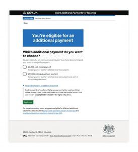
Helping teachers move smoothly through ‘decision pages’
One of the trickiest design problems during this project was presenting users with their eligibility page with more than one retention payment to choose from. Through various user testing sessions, we saw behaviour such as leaving the journey to check guidance, users missing the continue button and general confusion around why there were two amounts.
In total, we tested 6 different versions of this page in over 50 sessions, with the priority being to identify the minimum amount of information users needed to be able to make a decision and move through to apply for the payment.
Converting some of those findings into designs, our key decisions were:
- Visually split out ‘inform’ and ‘decide’ messaging - copy about eligibility from the flow of the journey by using a call out box at the top of the page
- Prioritise choice as the main action – we are telling users their eligibility information, but in order for them to understand their position in the journey we still needed to frame the question, which was “Which additional payment do you want to apply for”
- Use hint text to explain secondary information, some people don’t need information about the details of each policy, so we put this in hint text, which made it much easier to scan the information.
An early design of the eligibility results page vs a later version:

The final design of the eligibility page when a teacher is eligible for two payments:
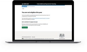
Introducing multiple ineligibility pages into the service
In total there are 18 different points where the service can determine that a user is not eligible. The service has been designed in a dynamic way which means users may leave the journey earlier and are shown the specific reason they are ineligible. This prevents users from having to answer more questions than required.
It was important to explain to users why they were not eligible so that they were not left to seek out further information such as checking guidance pages or contacting the helpdesk.
Example
We found that telling users they were not eligible was not enough for users to quickly grasp the criteria of the schemes. Despite being slightly longer, the pattern with the quickest comprehension followed a pattern of, you are not eligible because [reason], to be eligible you must [reason].
Making it easier to process claims
In order for teachers to receive their payment, each claim has to be processed and approved (or rejected) by the Claims team via an internal online portal.
Whilst the focus during this phase of work was to fully implement the new additional payment into the existing public-facing service, it was important to ensure the internal site was also user-centred and fully met the needs of the Claims team.
We completed an audit of the existing claims site to identify the use of the site and where improvements could be made, then documented our recommendations. Due to time constraints, only critical changes that would greatly improve the user experience or ensure the site was fully accessible have been implemented in time for the service going live.
Example
Previously an overview of all the submitted claims was shown in a table on a single page, but with the number of applications expected to be significantly higher than the previous year, this presents problems for the team being able to view and assign claims. We introduced the ability for users to navigate forwards and backwards through a series of pages (pagination). This removes the need for users to endlessly scroll through thousands of claims. By doing this, we reduce the load times but more importantly we make it easier for screen readers or keyboards to navigate through the information, improving accessibility.
Meeting accessibility standards
Every government service must be accessible to everyone who uses it. During user research, we tested the prototype for accessibility, and we also underwent an accessibility audit on the live service to ensure the service works with assistive technologies such as screen readers and meets the required WCAG 2.1 level AA standards.
The prototype was built in code using design components from the GOV.UK Design System (GDS) library. These components have the correct accessibility semantics already, which meant that we weren’t required to write this into the code ourselves. This provided us with a good starting point, however this alone doesn’t guarantee a fully accessible service.
Considerations still had to be made when it came to the design of each page, for example the structure of the page and the relationship between information and the placement of any action button is important.
We also supported the development team by checking the live service to spot any potential issues before the accessibility audit was carried out. With only minor adjustments, such as grouping two buttons in a specific way to ensure the correct spacing was applied, the service was 100% compliant the first time round so no further amendments were required.
Example
Originally, we had information on the eligibility results page that sat below the ‘Apply now’ button. We did this as a small number of participants were seeking out specific information on the policies in order to feel confident about their decision, but we felt this did not apply to all users. By doing this, the design was not fully accessible as screen readers are likely to miss anything under a continue button. In the next iteration, we stripped the information right back, and everything essential came before the button.
Learning from the Claims team and a multidisciplinary team set up
As well as contributing to the design of the prototype, we learned a lot from others about working in a multidisciplinary team. We worked in an excellent team who taught us how to be lean with our design tasks, clear with our design logic and work within set time frames. The way we worked ensured decisions were made collaboratively.
Finally, we would like to say thank you to the Claims team, who have such a vast knowledge of teaching, policy, and previous retention payment experience. This gave us vital knowledge and enabled us to make good designs for the users.
Impact of the live service
The service successfully launched in public beta on time, on the 5th of September 2022. 5,000 teachers applied for an additional payment on the first day of opening, leading to over 15,000 in the first week. This was more applications than the service received in total in any previous year.
The Levelling Up Payments project has also officially been nominated in the ‘Best Use of Data and Technology’ category of the 2022 DfE Awards.
Learn more

9 things to remember when doing research with underrepresented communities
Thinking
Show us your messy bits
Events, Inside Snook, Thinking
What to do when you don’t have a content designer
Snook Training, Thinking
Thinking in systems to address the climate crisis
Thinking